15 Years: Our Branding
 From the outset, there was only one typeface in our minds for Labour and Wait: Gill Sans.
These classic letterforms were designed by Eric Gill and first appeared around 1928. For us, Gill Sans perfectly embodies a graphic simplicity; clear, informative and timeless. Naturally, our choice was influenced by the iconic covers of the first Penguin books.
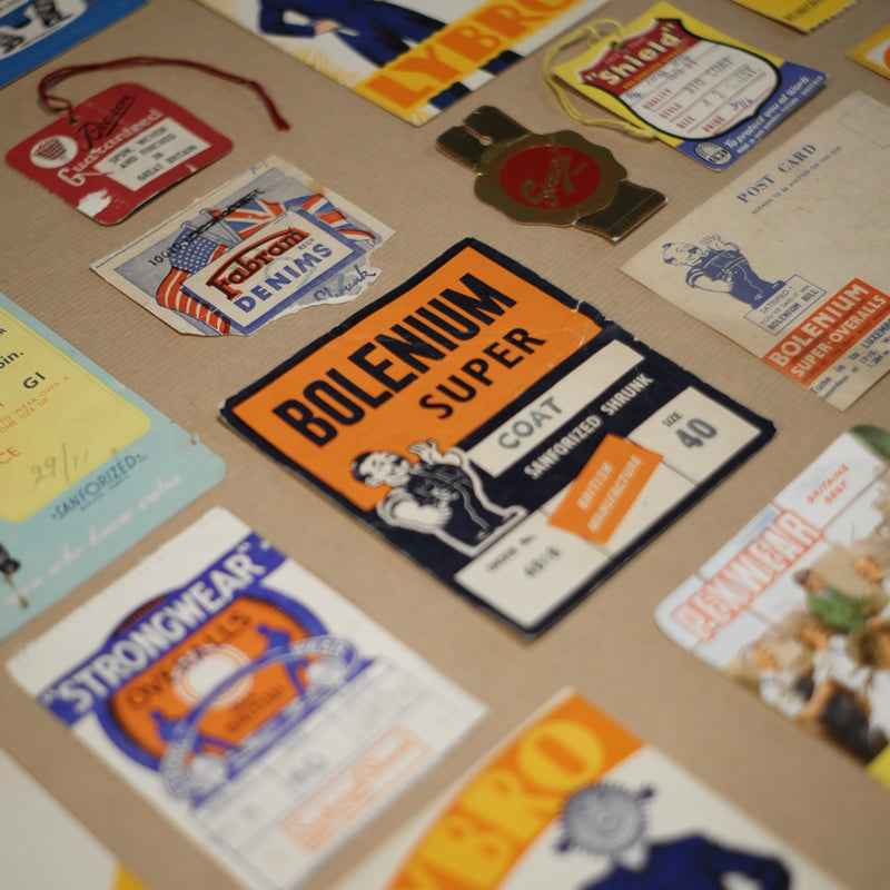
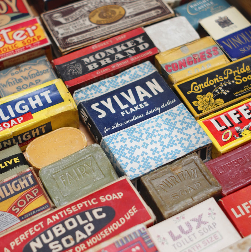
Gill Sans was also widely used for industrial supply catalogues from the 1930s through to the 1950s, which we enjoy collecting. In addition, we appreciate traditional stationery such as rubber stamps, embossed cards and school exercise books. We like to reference all this material in our branding.


